COVER ART: Dead-looking Girls in Poofy Dresses...
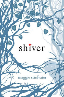
I've been thinking about cover art. It came to me as I watched Monster Three tear the page out of one my favourite books with one of my favourite covers. Shiver by Maggie Stiefvater. Maggie's an artist as well as successful author. By the way, I think I hate her ;) And I was wondering if she had much input into the cover.
The current trends are a bit different. There is the faceless, girl with hair in her eyes, big poofy dress style:


The current trends are a bit different. There is the faceless, girl with hair in her eyes, big poofy dress style:
I don't think this would work for Rosa as she pretty much wears grey trackies/sweatpants and a t-shirt for most of the story. She could probably pull off the hair all over her face though, but does a tangled, full of dirt and leaves look work? Probably not!
There's also the dead eyes/vacant look covers:
All I get from the first one is that she looks kind of constipated. The other one just looks bored. These are easy covers but don't tell you much about the book.
Rosa's world is grey, concrete, scratchy fabric, plain people with plain faces. A grey cover with a girl with ratty hair may not draw the eye. But her world opens up immensely in the second half of the book and her love of the trees, the wilderness could be used.
It's an interesting conundrum deciding what you give away/how much you give away on the cover. This one shows her grey world, with a hint of hope and a hint of colour leading the way for how her world changes in a scary but beautiful way at the same time. It's similar to the Shiver cover.

Maybe I'll just chuck twenty books on the floor and see which one the kids pull out, or at least don't seek to destroy immediately!


Comments